Ramon Robertson
Page Title
Red Moss – Foenander Galleries October 2023
Robertson’s new exhibition: Red Moss exhibition circles around themes of research, public art and public accessibility in and around different areas of Auckland. Within these themes are concepts looking at people and environment, and the nature of society.
One of the central ideas behind several works in this exhibition is influenced by an exploration of Bledisloe House. The paradox of this purpose-built council building, constructed in the “Modern” style was what initially intrigued Robertson. Conversations about the building revealed varied opinions on its heritage status and iconic presence. Adding to the intrigue, was the presence of Guy Ngan’s public art frieze on the rooftop penthouse, inaccessible to the public. The search for access to the frieze became a small project in itself and inspired the making of two wall relief works: Public society Service #1 & 2
An ongoing interest in Auckland Council’s Unitary Plan became an extension of the research of this project, exploring the concepts and nature of the sculptural work, which sits somewhere in the middle ground, between art and architecture. Ideas of art in society and art about society are contained in some of the works and act as a simple documentation of thoughts and subjects which connect to the sociological subject of what is a society.
Robertson is also interested in the human process of translating ideas to real form to phenomenological perception, via the viewer’s response. The natural abstraction in this process is manifest in the physical and three-dimensional responses in the exhibition, which aim to evaluate the space between person, art and environment. As such these works seem to activate the space around them, bridging the gap between internal and external worlds, allowing those of us in their field of influence to be more aware of our place in our surroundings.
Together with this exploration of union between people, structure and architecture, these playful and sometime humorous works, relate to urban development and its prioritising of systems and structure as an organising principal. In this respect, Robertson choice of materials: concrete, plaster, wood & resin, connect universal components used in building and manufacture to the individual.
Estuary art & Ecology Award 2022
Congratulations to Ramon Robertson who was awarded a Merit for his work titled Opaque at the recent Uxbridge Estuary Art and Ecology Award 2022, the only contemporary art award in Aotearoa New Zealand with ecology at its core. Artists were invited to research and respond to the Tāmaki estuary – to underscore the ecological value of this vital waterway, and to encourage action against its pollution.
Along one of the tributaries adding waters to the Tamaki Estuary, I stumbled upon this scene, right place at the right time, almost like a crime scene. The image was taken during an evening walk along Botany Creek which leads to Pakuranga Creek and eventually into the Tamaki Estuary.
Pakuranga Creek, and others leading into the Estuary are some of the worst polluted waters in Tamaki Makaurau. This photograph displays an awkward yet compelling pull between human progression, wildlife and environment. It impacted me significantly. There was a guilty pleasure in finding this environmental moment, a moment of horror, of ugly beauty and of a curious co-existence between humans, wildlife and environment: a co-existence that drives the purpose of this exhibition. The white substance pouring from a drain into the creek was from a nearby building site and under cover of night, the opaque water created long luminescent white arteries, cloud-like in their forms, in which swam two eels, eerily preoccupied in their own investigation.
– Ramon Robertson, 2022
Natural Habitats 2021
The title “Natural Habitats” usually resonates with ideas of nature, eco systems, land and water; something different to a world we share together in our built environments. I prefer to look at it in terms of our everyday living environments and the world we inhabit here and now, together with its complex and intriguing systems and layers. This new series of artworks continues to embody a relationship between people and man-made structural form and makes reference to the hidden syndicate of people involved in the creation of the city…. like a homage to the thinkers, planners and architects of the world we inhabit.
Within these works is also incorporated another layer of ideas; ideas which have interested and intrigued me, with themes relating to advertising; signage; material as product; identity. These are often the things that surround us and are present during every moment of the day. The works are not a comment against these influential themes but an acceptance of it, plucking out what I see as alluring rather than displeasing. Topics relating to approaches to architecture are also explored and references to the unhindered layering of the city are hinted at.
The modern phenomenon of uniformity, standardisation and simplicity of form are themes affecting our lives, impacting on our perception of the world we inhabit. Le Corbusier once said that “a house is a machine for living in”. This idea resonates through the sculptural work in the exhibition and manifests in sometimes very utilitarian and practical procedures through the method of casting, making, choice of object and colouration of works. It is also within these themes that I have chosen to incorporate the mundane, the banal and the ordinary, with a twist of the idiosyncratic, while at the same time, retaining the essence of humanity, popular culture and familiarity of form.
Ramon Robertson - Natural Habitats December 2021 - Reviewed by Michael Dunn for Art New Zealand.
Extract from review. Review is under copyright by Art New Zealand.
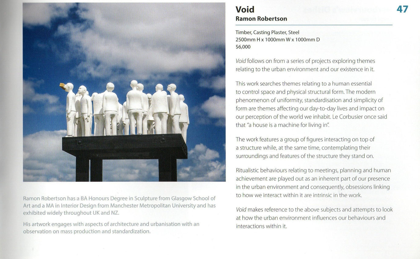
I first came aware of Ramon Robertson’s sculpture at the Pah Homestead. In the sculpture garden I spotted a group of small white figures standing on a platform raised above the lawn. (Sadly, now vandalized and no more.) Later I discovered a comparable group in a private garden visible from Melville Park where I quite often take a walk. The whiteness and the stillness of the figures, all seemingly male, attracted my attention and raised my curiosity about the identity and purpose of the works. There is something engaging about these figures that have a quirky almost abject quality. They are like fellow travellers in our world beset by problems and shaped by experiences that have taken a toll. Although they stand apart from us in their own psychological space, they have a presence that compels our attention and indeed our sympathy. They humanise the environment rather than alienate it from us.
-- Michael Dunn
Ramon Robertson
Artist statement/Concept/Dimensions and materials for two Bronze editions for Auckland Art Fair 2021
“Colour Chromatic” & “Chromatic Report” are two works which engage with aspects of architecture and urbanisation and they explore themes relating to the urban environment and our existence in it.
The modern phenomenon of uniformity, standardisation and simplicity of form are themes affecting our day-to-day lives and impact on our perception of the world we inhabit. Le Corbusier once said that “a house is a machine for living in”. It is within these themes that I am trying to simplify, or almost objectify the figure, while at the same time, retaining the essence of humanity, popular culture and familiarity of form.
These works hold in them a relationship between people and man-made structural form and make reference to the hidden syndicate of people involved in the creation of the city...., like a homage to the thinkers, planners and architects of the world we inhabit.
Human conditioning and ritualistic behaviours are implied here as a significant part of our presence in the urban environment and consequently, obsessions linking to how we interact within it and manipulate space are intrinsic in the work.
In terms of our interaction with our environments, conformity and nonconformity is inherent in the world we live in and is another theme implied in these two works. “Colour Chromatic” looks to be a standard jacketed figure and in my eye the wearer seems to comfortably conform with what he is wearing. I have attempted to use the jacket as a wearable structure, almost like an architectural jacket, intricate, complicated, yet familiar in its form. “Chromatic Report” displays a slight nonconformity with its juxtaposition of bare top and architectural object which is worn like a mask. The figure seems to be over absorbed in an activity of looking, or studying something, to the point where he is unaware of being partly clothed. Both figures attempt to portray a feeling of being healthily indulged in something: an interest, an obsession, an idea.
Both works are in bronze, one in gold patina and the other in black patina. These bronzes are both from an edition of five with two artist proofs. “Colour Chromatic” also has an edition of five in black patina.
Both Editions were first cast in bronze in February 2021
Materials and dimensions.
Title: Colour Chromatic, Bronze with gold patina. Dimensions(mm), Height 480, width 145, depth 100, Edition (to be confirmed). From an edition of 5 in gold patina. There is also an edition of 5 in black patina.
Title: Chromatic Report, Bronze with black patina. Dimensions(mm), Height 480, width 145, depth 100, Edition (to be confirmed). From an edition of 5 in black patina.
Exhibition with Belinda Griffiths and Matthew Carter, Foenander Galleries, Mt Eden, September 2019
Ramon Robertson’s sculpture engages with elements of conformity and union between people, structure and environment with a specific focus on the human condition and behaviour in the city These works navigate the complex layers of human interaction involved in the planning and deployment of ideas in creating a habitable environment which perhaps contradicts our perception of the city asa place of readiness, facility and simplicity.
Ramon’s work, often humorously, suggests a hidden syndicate or infrastructure of people behind the scenes. Four of the larger sculptures work together in pairs, as a group indicating a connectedness and willing participation in the human design process, while at the same time revealing a silent hierarchy and uniformity in roles and involvement in this collaborative process. His choice of materials (concrete, plaster and wood) link the universal components used in building and manufacture to the individual – making reference to not just the mass-standardisation of objects and resources used in the configuration of the city – but to the population also.
Q&A with Ramon Robertson and Foenander Galleries
Nov 29 2021
You asked the questions and Ramon answered them.
What material/medium do you use?
Mainly plaster and concrete and I also love the use of mixed-media.
Is your work self-portraiture?
Haha! But No. There is sometimes a slight auto-biographical element in the work but never self-portraiture.
What’s the largest and smallest scale you’ve worked to?
The Largest works I’ve made would be my Degree pieces. They were about 500cm long and 150cm high, and 3 of them.
The smallest was a miniature bronze I made at GSA [Glasgow School of Art] in year 2. The budget only allowed for a very small work and the brief said it had to fit in the palm of your hand.
Your work seems architectural, what is your interest in architecture?
My interest in architecture started as a student at GSA. My first interest was ignited by a book called “Unbuilt America” which I still remember carrying around with me as a student. This went on to an interest in Archigram London which is still fascinating today and worth a look. Things just snowballed from there and culminated in my degree show being these large architectural models/sculptures in aluminum steel and concrete. Brutal but beautiful.
How are your figures related to each other?
I don’t know really. Sometimes they relate and sometimes not. Maybe they all demonstrate a healthy preoccupation with the world we live in and sometimes I think there is a little bit of all of us in the sculptures, but I could be wrong. I try not to give myself too many rules and be as experimental as I can when developing new works. This will mean that the figures or sculptures don’t always relate physically or thematically.
Why are the eyes often covered?
The viewer responds differently to the covered eyes. The work is read very differently, which is what I want. I’m more interested in the figure as an object than a figure as representation and the lack of identity on the figures has the effect I’m looking for.
Is the concrete plinth in your work pragmatic or conceptual?
Both really. I use it very practically at times in the plinths but even a simple plinth reminds me of why I use it… It’s highly toxic as a material and is only stable when cast and set. Once it starts to decay, like in architecture, it is toxic again. It’s more of a temporary material than we think, although it looks and feels safe and indestructible; Back in the day builders always talked about concrete’s 50-year cycle before it would deteriorate. For these reasons I always liked the enigma and contradiction of using concrete.
I think concrete is more advanced now and I love the world’s passion for it.
What’s your process?
As I mentioned before, I try not to give myself too many rules and be as experimental as I can when developing new works. Mostly I’ll try to stick with my umbrella theme of architecture but now and then things veer off in different directions. When this happens, I just try to go with it and trust my ideas and imagination. This experimentation sometimes works sometimes doesn’t, but it’s a fun way to work.
Sometimes my approach is more by the book: I’ll research something, design a work based on that research, and then make it.
How would you describe your work?
That’s difficult to answer but here goes. Experimental, often developmental without resolution, sometimes conceptual sometimes descriptive, naïve, sometimes based on fact, sometimes based on pure imagination, imaginative, slightly edgy, slightly honest…, where do I stop.
Most unfortunate studio mishap?
Nothing too drastic really. I’ve had lots of small breaks or drops of works, a few injuries, cuts etc.
Most memorable artwork/s you have seen in person?
I always loved “Venus de Milo” which I saw when I was about 14 and the aura of it always stayed with me. “Guernica” by Picasso blew me away. I couldn’t stop looking at it. Every time I see Donald Judd’s work it’s fascinating.
Which other artists do you admire (locally and internationally)?
Tony Oursler, Cindy Sherman, Bill Viola, Ralph Steadman, Jake & Dinos Chapman, Donald Judd, Bernie and Donna Harfleet, David Lynch, Matthew Carter, Francisco Goya and many many more.
How has Covid affected/influenced your practice?
Covid has not really influenced my work but it has affected the way I work a little. The disruption caused by school closures meant I had to juggle my time between doing my work and spending time helping the kids do their work, and just spend time with them. For this reason, some weeks were more productive than others. During level 4 I ran out of several different materials so it was a bit of an exercise to try to be productive with what I had. All good though…
What do you like?
I liked Neal Palmer’s answer for this one…
For some reason I like the idea of sitting in an old spit ‘n’ sawdust pub, maybe in the old homeland, having a beer with my boys… when they are old enough.
Morning, evening or all day long?
Trying to think of a song title to answer this one…, ok, got one! “All day and all of the night”… JK
Or maybe it’s more like “Losing my edge”.
What’s your studio soundtrack?
Momma, Roy Irwin, Rugged Moon, BJM and recently enjoying some Claude Debussy, especially Clair de lune.
Tell us about your first sculptural figure?
My very first sculpture at GSA was a figure during my foundation year. It was a timber construction of a figure balancing a large vessel on its head and about 120cm tall. I still enjoy the memory of it.
Studio tool you couldn’t go without?
My mini chisels